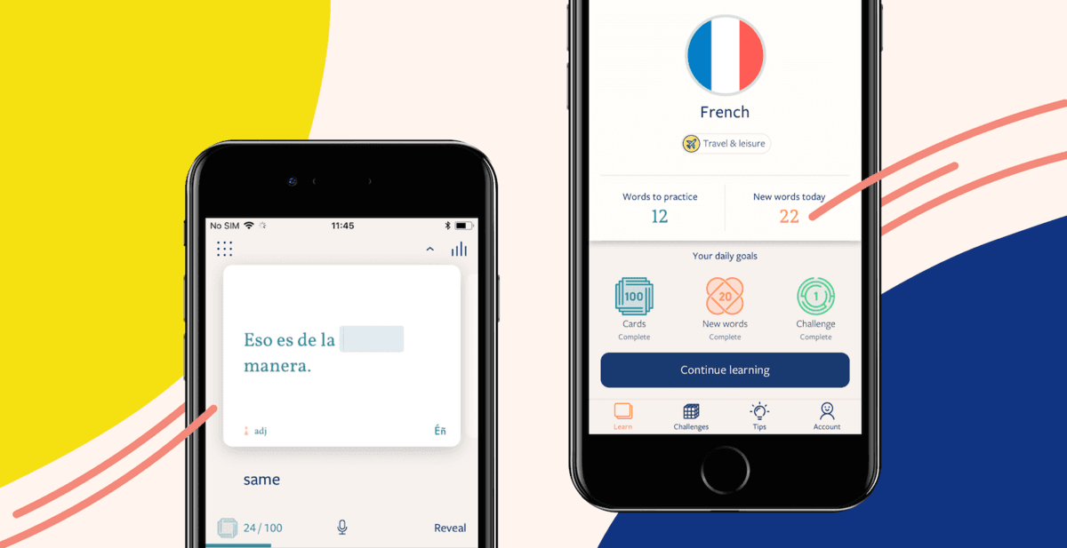
With our latest updates, many of our learners will see some improvements to the look and feel of the Lingvist app. This is all part of a movement towards a bolder, more eye-catching aesthetic that will unify our brand and create a more focussed and comfortable learning experience.
Using brighter and warmer colours, we’ve introduced tones which are easier on the eye. The spectrum we chose will help keep eye fatigue at bay, letting you learn for longer during each study session. Oh, right — it looks pretty nice, too!

We also dialled up the colour contrast, so the app now has a bit more visual depth. This is important because it makes it easier to pick out and navigate certain elements. If you’re a fan of “Cosmos”, our high-contrast colour scheme, you’ll likely notice this change the most: the new, more vibrant hues of blue add more dimension.
You may also notice some changes to our typography and fonts. We have a new typeface that’s easier to read and works better on screens, especially on mobile devices. We’re confident that the better readability will also help you focus on learning with less eye fatigue.
One thing that doesn’t change, despite all the improvements, is a commitment to keeping our overall look minimal and clutter-free. Our core design belief is that your focus should always be on the act of learning, with no distractions caused by extra items and intrusive functions, but still creating a fun and longer-lasting learning experience.
Keep an eye out for our new look, coming up soon on iOS and Android devices, and in a few weeks on Lingvist for web.


